Lies, damned lies, and the size of government
by John MacBeath Watkins
Shrinking the size of the federal government has been a theme of every president since Jimmy Carter came into office in 1976.
So why doesn't it shrink?
There are a couple of answers to this. One is that it has shrunk. Federal employment peaked in 1967 at 6.4 million, according to this source: http://www.opm.gov/feddata/HistoricalTables/TotalGovernmentSince1962.asp
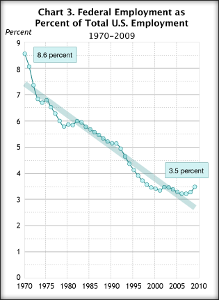
And now it stands at 4.4 million. Of course, that has happened against a background of employment growth in the rest of the economy, such that federal employment as a percent of total employment has been falling for decades, according to this source: http://www.musingsfrommars.org/2011/01/a-lie-thats-either-malicious-ignorance-or-deliberate-malice.html
 That includes the military, and most of those who object to the growth of government also object to any attempt to cut military spending, so I should mention that civilian employment has also fallen since it reached its peak in 1990 under Bush the Elder at 3.067 million. Civilian employment stood at 2.774 in 2010, the most recent year for which I can find numbers. Of course, state and local government employ people as well, which is where the real growth has been:
 And, of course, the other answer is that these numbers don't really capture the growth in federal employment because contractors and people hired on federal grants don't appear there. Bush the Younger was particularly prone to growing the government with contractors. Finding out the real size of government takes some sleuthing, which Paul C. Light did in this study. (You can click on the chart to make it larger.)

Light found that federal employment including contractors and such fell 12.6% from 1990 to 1999, increasing between 1999 and 2005 by 35%, mainly in the final three years, when George W. Bush had managed to implement his policies. Clearly, the size of government by some measures varies much more than our second chart would indicate.
It will take Prof. Light or someone like him to make a study that shows what's really happening now, but we can be almost certain that those trying to terrify us with stories of how much government has grown will be playing fast and loose with the numbers. Compare the growth in the civilian labor force in this chart to the flat line for federal employment in our second chart (from here):
 This, of course, explains chart 1, which showed federal employment falling as a percentage of total employment. The problem is that many of those showing up as employed by state and local government are supported by federal grants, and until reporting changes, tracking the number of contract employees will be quite hard to track as well.
Shrinking the size of the federal government has been a theme of every president since Jimmy Carter came into office in 1976.
So why doesn't it shrink?
There are a couple of answers to this. One is that it has shrunk. Federal employment peaked in 1967 at 6.4 million, according to this source: http://www.opm.gov/feddata/HistoricalTables/TotalGovernmentSince1962.asp
And now it stands at 4.4 million. Of course, that has happened against a background of employment growth in the rest of the economy, such that federal employment as a percent of total employment has been falling for decades, according to this source: http://www.musingsfrommars.org/2011/01/a-lie-thats-either-malicious-ignorance-or-deliberate-malice.html


Light found that federal employment including contractors and such fell 12.6% from 1990 to 1999, increasing between 1999 and 2005 by 35%, mainly in the final three years, when George W. Bush had managed to implement his policies. Clearly, the size of government by some measures varies much more than our second chart would indicate.
It will take Prof. Light or someone like him to make a study that shows what's really happening now, but we can be almost certain that those trying to terrify us with stories of how much government has grown will be playing fast and loose with the numbers. Compare the growth in the civilian labor force in this chart to the flat line for federal employment in our second chart (from here):

Comments
Post a Comment